


Introduction
Dropdown menus are pretty much essential in the navbar of most websites. As your website grows you will likely find that a standard dropdown menu no longer works for you — it becomes bloated, difficult to wade your way through the list and so creates a poor user experience. Once this happen (well, before it happens) a mega menu is available to save the day… and keep users browsing your site.
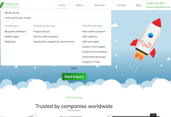
A mega menu is a dropdown menu that contains multiple levels. It allows a lot of links to be contained in a single dropdown without compromising the usability. In fact, it improves the usability. By keeping a lot of links in the same dropdown users have to click less to get where they want. A mega menu allows you to group links together into categories… it’s not a million miles off putting several dropdown menus into a single dropdown menu.
Mega menus can get huge and, on particularly large websites, will often be full-width (i.e. take up the entire width of the viewport). They don’t have to be though. Don’t feel you need to wait until you can take up the full width, or use the full width if it’s not the optimum size. Use what is best for your site. What is best for your site is what is easiest for your users to navigate. As we all know, if a site is hard (or even simply not easy) to navigate, your visitors will not stick around long and will leave to go to a competing site that is easy to navigate.
Make It
In this coded example I’m going to use the mega menu we use on our website. There are far bigger examples available but, as ours is relatively small, we can keep the code easier to follow. It still contains the elements you will need so is easy to expand as is necessary for your site. If you want to see what it looks like on the actual website click here. Of course if you have any questions or require any assistance putting your nav together please contact us.
For clarity I’m going to build the bulk of the navbar first in the next bunch of code. After that I’ll show the code for the mega menu. Finally we’ll put it all together into one glorious mega menu’ed navbar!
The Navbar
This is a responsive navbar built using Bootstrap’s navbar component. As Bootstrap is a mobile-first framework, the default is a collapsed burger-menu toggler controlled nav. This example expands at the large breakpoint using the class .navbar-expand-lg.
You’ll notice I have also added some padding to each .nav-item. You don’t need this, I’ve just done it to make stuff a little clearer.
<!-- create your responsive navbar -->
<nav class="navbar navbar-light bg-light navbar-expand-lg" id="myNavbar">

<!-- next is your mobile burger menu toggle -->
 <button class="navbar-toggler" type="button" data-toggle="collapse" data-target="#mainNav" aria-controls="mainNav" aria-expanded="false" aria-label="Toggle navigation">
  <span class="navbar-toggler-icon"></span>
 </button>

<!-- next is where your logo goes -->
 <a href="#" class="navbar-brand">Navbar Brand</a>

<!-- now we go to the main bit of the nav -->
<div class="collapse navbar-collapse" id="mainNav">
  <ul class="navbar-nav ml-auto nav-fill">

   <li class="nav-item px-4">
    <a href="#" class="nav-link">Home <span class="sr-only">(current)</span></a>
   </li>

   <li class="nav-item px-4 dropdown">
    <!-- we will put our "Services" mega menu in here -->
   </li>
   <li class="nav-item px-4">
    <a href="#" class="nav-link">Contact</a>
   </li>
   <li class="nav-item px-4">
    <a href="#" class="nav-link">Blog</a>
   </li>
  </ul>
 </div>
</nav>
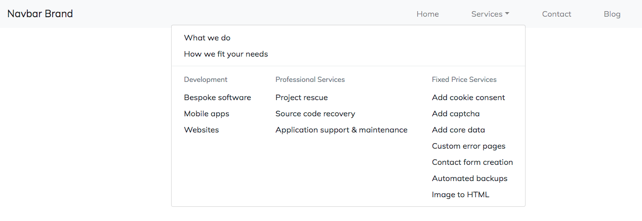
The Mega Menu
The bit we’ve all been waiting for! This will not work by itself… it needs to go into the space where the comment in the navbar code above is.
A quick bit of explanation to review as you look through the code below. You will see we have a couple of standard .dropdown-items first. We have separated them out as they give a high level explanation about our services rather than more specific services we offer. To separate those two from the rest of the mega menu, we use a .dropdown-divider. A .dropdown-divider is simply a grey line that allows you to clearly separate out sections of the mega menu.
If you need hosting for your Laravel projects, we like DigitalOcean, you can get $100 hosting credit to try it out if you sign up via this link.
The next bit is the list of services we offer split into three core categories. The categories are arranged as columns. You can choose how you do this. You could use rows and columns or you could use, as I have done, flex to achieve your goal.
<!-- first is the link in your navbar -->
<a class="nav-link dropdown-toggle" href="#" id="servicesDropdown" role="button" data-toggle="dropdown" aria-haspopup="true" aria-expanded="false">Services</a>
<!-- your mega menu starts here! -->
<div class="dropdown-menu dropdown-menu-right" aria-labelledby="servicesDropdown">
<!-- the standard dropdown items -->
<a class="dropdown-item" href="#">What we do</a>
<a class="dropdown-item" href="#">How we fit your needs</a>
<!-- next, a divider to tidy things up -->
<div class="dropdown-divider"></div>
<!-- finally, using flex to create your layout -->
<div class="d-md-flex align-items-start justify-content-start">
<div>
<div class="dropdown-header">Development</div>
<a class="dropdown-item" href="#">Bespoke software</a>
<a class="dropdown-item" href="#">Mobile apps</a>
<a class="dropdown-item" href="#">Websites</a>
</div>
<div>
<div class="dropdown-header">Professional Services</div>
<a class="dropdown-item" href="#">Project rescue</a>
<a class="dropdown-item" href="#">Source code recovery</a>
<a class="dropdown-item" href="#">Application support & maintenance</a>
</div>
<div>
<div class="dropdown-header">Fixed Price Services</div>
<a class="dropdown-item" href="#">Add cookie consent</a>
<a class="dropdown-item" href="#">Add captcha</a>
<a class="dropdown-item" href="#">Add core data</a>
<a class="dropdown-item" href="#">Custom error pages</a>
<a class="dropdown-item" href="#">Contact form creation</a>
<a class="dropdown-item" href="#">Automated backups</a>
<a class="dropdown-item" href="#">Image to HTML</a>
</div>
</div>
</div>
All Together Now
The mega menu we’re coding using Bootstrap 4
Feel free to copy this code and paste it into your chosen text editor. Simply stick it between your <body> tags and you’ve got yourself a mega menu navbar template to work from. If you would like a starter template for a Bootstrap project check out our post about getting started with Bootstrap 4.
<nav class="navbar navbar-light bg-light navbar-expand-lg" id="myNavbar">
<button class="navbar-toggler" type="button" data-toggle="collapse" data-target="#mainNav" aria-controls="mainNav" aria-expanded="false" aria-label="Toggle navigation">
<span class="navbar-toggler-icon"></span>
</button>
<a href="#" class="navbar-brand">Navbar Brand</a>
<div class="collapse navbar-collapse" id="mainNav">
<ul class="navbar-nav ml-auto nav-fill">
<li class="nav-item px-4">
<a href="#" class="nav-link">Home <span class="sr-only">(current)</span></a>
</li>
<li class="nav-item px-4 dropdown">
<a class="nav-link dropdown-toggle" href="#" id="servicesDropdown" role="button" data-toggle="dropdown" aria-haspopup="true" aria-expanded="false">Services</a>
<div class="dropdown-menu dropdown-menu-right" aria-labelledby="servicesDropdown">
<a class="dropdown-item" href="#">What we do</a>
<a class="dropdown-item" href="#">How we fit your needs</a>
<div class="dropdown-divider"></div>
<div class="d-md-flex align-items-start justify-content-start">
<div>
<div class="dropdown-header">Development</div>
<a class="dropdown-item" href="#">Bespoke software</a>
<a class="dropdown-item" href="#">Mobile apps</a>
<a class="dropdown-item" href="#">Websites</a>
</div>
<div>
<div class="dropdown-header">Professional Services</div>
<a class="dropdown-item" href="#">Project rescue</a>
<a class="dropdown-item" href="#">Source code recovery</a>
<a class="dropdown-item" href="#">Application support & maintenance</a>
</div>
<div>
<div class="dropdown-header">Fixed Price Services</div>
<a class="dropdown-item" href="#">Add cookie consent</a>
<a class="dropdown-item" href="#">Add captcha</a>
<a class="dropdown-item" href="#">Add core data</a>
<a class="dropdown-item" href="#">Custom error pages</a>
<a class="dropdown-item" href="#">Contact form creation</a>
<a class="dropdown-item" href="#">Automated backups</a>
<a class="dropdown-item" href="#">Image to HTML</a>
</div>
</div>
</div>
</li>
<li class="nav-item px-4">
<a href="#" class="nav-link">Contact</a>
</li>
<li class="nav-item px-4">
<a href="#" class="nav-link">Blog</a>
</li>
</ul>
</div>
</nav>
Conclusion
Hopefully with the code and explanations above alongside the code comments, you’ll be able to put together your own Mega Menu with ease. You could use some of Bootstrap’s own utility classes to add some colour or some spacing utilities, like I have done, to give a bit of room between your menu items. You can even add in images, forms and more besides. Really, once you’ve got your head around the basics like we’ve gone through here, you can add elements to your heart’s content. Do remember to make sure that whatever you do improves the usability of your website or, at least, makes it more engaging.
Further Reading
We are creating a series of tutorials to help beginners through the process of getting to grips with Bootstrap. You can access them with the links below. If you have any requests for tutorials please get in touch with us.
- Bootstrap 4: Getting Started
- Bootstrap Buttons
- Bootstrap Button Groups
- Bootstrap Cards
- Bootstrap Accordion
- Bootstrap Forms
- Bootstrap Carousel