


Introduction
Pricing tables are all over the place online. Normally two or three lists of features with a price at the top and a button to buy the thing at the bottom. There are a number of free pricing table templates available but the fact you are limited in terms of styling and so on can make them less desirable.
In this tutorial we’re going to look at how to build your own pricing table using standard Bootstrap components. I’m going to style them using the built in Bootstrap styles but of course this is easily overridden with custom CSS so you can make them fit in with the rest of your website.
What We’ll Use
In this coded example we’re going to use Bootstrap’s card component to build our pricing table. The reason we’re going to use cards is that they are highly flexible with a load of options to extend them into great containers for content.
There are card-headers in which we can put our product name and its price. There are list-groups which we can use for listing the features of our product. There are also card-footers which we can use for our CTA buttons.
What elevates cards even further when using them to create pricing tables are the responsive layout options. Namely card groups and card decks. Using card-groups or card-decks ensures that your pricing table is grouped nicely. All the cards will be equal height with the footers lining up for uniform sizing.
I’m going to use card-decks in this example as I like the gap they create between each of the cards. However if you would rather have the cards joined together just swap out the card-deck class for card-group.
Make It
To keep things as clear as possible, we’re going to build our pricing table in three steps. First of all we’ll make a single card. Second, we’ll copy that card so we have three of them and wrap them inside a card-deck. Third we’ll use some Bootstrap styles to make them look a bit more interesting. Of course, step three is very subjective so you can style them however you like, even using custom CSS if you like.
The Card
I’m not going to explain too much here about the elements within the card. If you’re not particularly familiar with them you can check out our tutorial on them. We’re going to use card-header, card-body, list-group and card-footer to build our card.
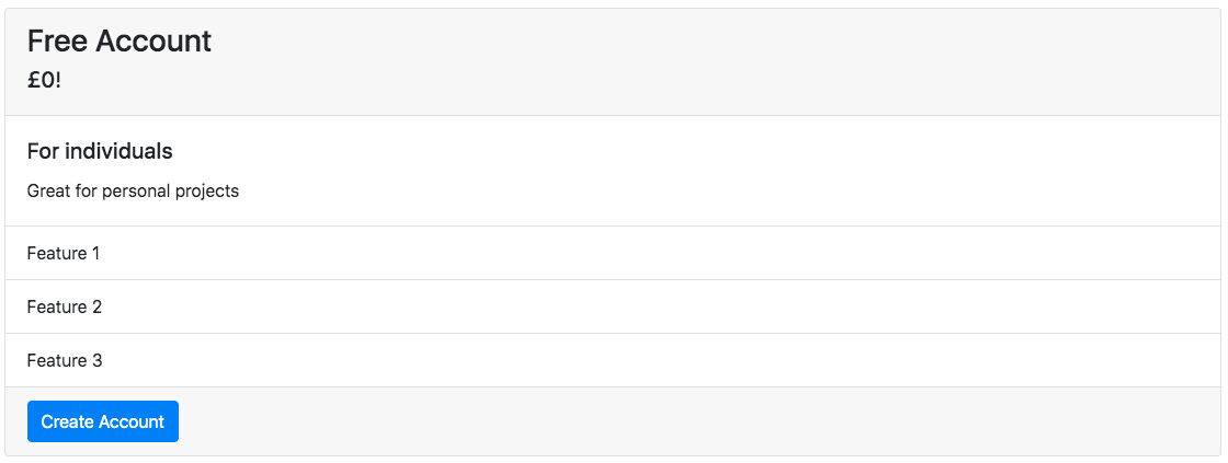
The Card
<!-- start of the card -->
<div class="card">
<!-- product name -->

  <div class="card-header">
    <h3>Free Account</h3>
    <h5>£0!</h5>
  </div>
<!-- short product description -->
  <div class="card-body">
    <h5 class="card-title">For individuals</h5>
    <p class="card-text">Great for personal projects</p>
  </div>
<!-- feature list -->
  <ul class="list-group list-group-flush">
    <li class="list-group-item">Feature 1</li>
    <li class="list-group-item">Feature 2</li>
    <li class="list-group-item">Feature 3</li>
  </ul>
<!-- call to action -->
  <div class="card-footer">
    <a href="#" class="btn btn-primary">Create Account</a>
  </div>
</div>
The Card Deck
Now we’ve built our first card, we can copy it to create two more. We can then edit the content on the two new cards then wrap all three in a card-deck.
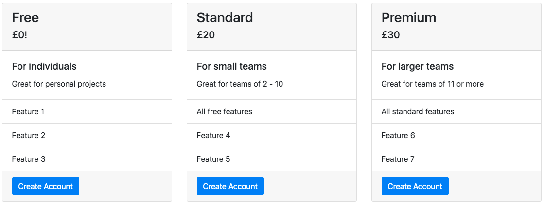
The card deck with default styles
<div class="card-deck">

<!-- CARD 1 -->

  <div class="card">
    <div class="card-header">
      <h3>Free</h3>
      <h5>£0!</h5>
    </div>

    <div class="card-body">
      <h5 class="card-title">For individuals</h5>
      <p class="card-text">Great for personal projects</p>
    </div>

    <ul class="list-group list-group-flush">
      <li class="list-group-item">Feature 1</li>
      <li class="list-group-item">Feature 2</li>
      <li class="list-group-item">Feature 3</li>
    </ul>

    <div class="card-footer">
       <a href="#" class="btn btn-primary">Create Account</a>
    </div>
  </div>

<!-- CARD 2 -->

  <div class="card">
    <div class="card-header">
      <h3>Standard</h3>
      <h5>£20</h5>
    </div>

    <div class="card-body">
      <h5 class="card-title">For small teams</h5>
      <p class="card-text">Great for teams of 2 - 10</p>
    </div>

    <ul class="list-group list-group-flush">
      <li class="list-group-item">All free features</li>
      <li class="list-group-item">Feature 4</li>
      <li class="list-group-item">Feature 5</li>
    </ul>

    <div class="card-footer">
      <a href="#" class="btn btn-primary">Create Account</a>
    </div>
  </div>

<!-- CARD 3 -->

  <div class="card">

    <div class="card-header">
      <h3>Premium</h3>
      <h5>£30</h5>
    </div>

    <div class="card-body">
      <h5 class="card-title">For larger teams</h5>
      <p class="card-text">Great for teams of 11 or more</p>
    </div>

    <ul class="list-group list-group-flush">
      <li class="list-group-item">All standard features</li>
      <li class="list-group-item">Feature 6</li>
      <li class="list-group-item">Feature 7</li>
    </ul>

    <div class="card-footer">
      <a href="#" class="btn btn-primary">Create Account</a>
    </div>
  </div>
</div>
Styling
We’ve now got our full pricing table but it looks a bit boring so we’ll make it look a bit more interesting here. I’m just going to use Bootstrap’s built in styles but, as I said, you can use different styles or your own CSS. Have a look around online to get some ideas. You can start with the pricing table on one of our websites by clicking here.
I’m going to use text-centerto align all the content centrally on each of the cards. I’m then going to use a shadowto make the cards popa bit more.
To encourage people to purchase the “Standard” pricing tier I’ll highlight it more. I’m going to do so using bg-successto make the card-headergreen and text-whiteso the text shows up better. I’m then going to use border-successon both the cardand the list-group-items. Finally I’ll change btn-primaryto btn-successon the CTA to tie it all together.
On the “Free” and “Premium” tiers I’m going to change btn-primaryto btn-infoon the CTAs. This is because personally I feel it is a little less of an intense colour and so draws the eye away from the “Standard” tier less.
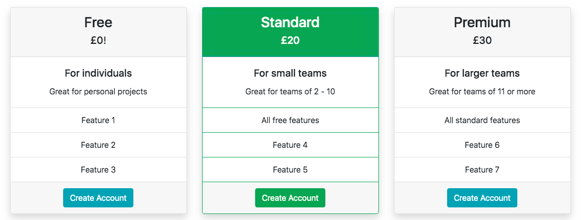
The card deck with new styles applied
<div class="card-deck">

<!-- CARD 1 -->

  <div class="card text-center shadow">
    <div class="card-header">
      <h3>Free</h3>
      <h5>£0!</h5>
    </div>

    <div class="card-body">
      <h5 class="card-title">For individuals</h5>
      <p class="card-text">Great for personal projects</p>
    </div>

    <ul class="list-group list-group-flush">
      <li class="list-group-item">Feature 1</li>
      <li class="list-group-item">Feature 2</li>
      <li class="list-group-item">Feature 3</li>
    </ul>

    <div class="card-footer">
       <a href="#" class="btn btn-info">Create Account</a>
    </div>
</div>

<!-- CARD 2 -->

  <div class="card text-center shadow border-success">
    <div class="card-header text-white bg-success">
      <h3>Standard</h3>
      <h5>£20</h5>
    </div>

    <div class="card-body">
      <h5 class="card-title">For small teams</h5>
      <p class="card-text">Great for teams of 2 - 10</p>
    </div>

    <ul class="list-group list-group-flush">
      <li class="list-group-item border-success">All free features</li>
      <li class="list-group-item border-success">Feature 4</li>
      <li class="list-group-item border-success">Feature 5</li>
    </ul>

    <div class="card-footer">
      <a href="#" class="btn btn-primary">Create Account</a>
    </div>
</div>

<!-- CARD 3 -->

  <div class="card text-center shadow">

    <div class="card-header">
      <h3>Premium</h3>
      <h5>£30</h5>
    </div>

    <div class="card-body">
      <h5 class="card-title">For larger teams</h5>
      <p class="card-text">Great for teams of 11 or more</p>
    </div>

    <ul class="list-group list-group-flush">
      <li class="list-group-item">All standard features</li>
      <li class="list-group-item">Feature 6</li>
      <li class="list-group-item">Feature 7</li>
    </ul>

    <div class="card-footer">
      <a href="#" class="btn btn-primary">Create Account</a>
    </div>
  </div>
</div>
Conclusion
You should be able to use what we’ve gone through here to create a great pricing table. We hope you found the tutorial useful. If you did, check out our other tutorials on our blog.