


What Is An Accordion?
An accordion is a group of vertically stacked items, most commonly titles / labels. The items can then be expanded to show previously hidden content. The expandable items will generally have a border or some other visual way of separating them from the rest of the page. This visual format coupled with the expandable nature of the accordion is what leads to the name “accordion”, taken from the musical instrument of the same name.
You can see an example below of a basic accordion built with Bootstrap 4. You can also have a go yourself by clicking this link.
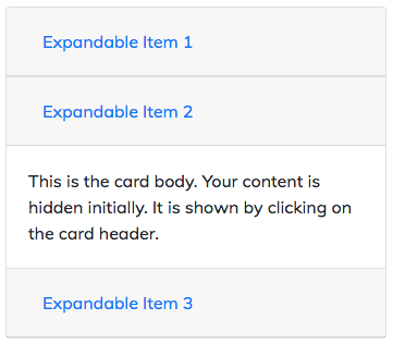
A basic accordion created with Bootstrap 4 cards
Why Use An Accordion?
An accordion is a great way to bring together related content. Hiding the majority of the content in a collapsed window prevents information overload for users. It also allows users to very easily access the information they are interested in without having to scroll to it.
As web designers / developers we should all be concerning ourselves with how our users will interact with our creations. Generally an accordion will improve the user experience (UX) of your site when used correctly so it is a great component to add to your skill set.
How To Make An Accordion
Whilst it is, of course, possible to make an accordion from scratch, Bootstrap 4 makes it super easy. The code, from the developer / designer’s point of view, is really lean with very little required given what the result is. So, with no further ado, let’s have a look at how to make an accordion.
Below is the code I used to make the example basic accordion depicted in the image above. Make sure your page has the appropriate scripts and Bootstrap CSS in it. Check out my other article Bootstrap 4: Getting Started if you're not sure what you need.
<div class="accordion" id="exampleAccordion">
<div class="card">
<div class="card-header" id="exItem1Header">
<h5 class="mb-0">
<button class="btn btn-link collapsed" type="button" data-toggle="collapse" data-target="#exItem1" aria-expanded="false" aria-controls="exItem1">Expandable Item 1</button>
</h5>
</div>
<div id="exItem1" class="collapse" aria-labelledby="exItem1Header" data-parent="#exampleAccordion">
<div class="card-body">This is the card body. Your content is hidden initially. It is shown by clicking on the card header.</div>
</div>
</div>

<div class="card">
<div class="card-header" id="exItem2Header">
<h5 class="mb-0">
<button class="btn btn-link" type="button" data-toggle="collapse" data-target="#exItem2" aria-expanded="true" aria-controls="exItem2">Expandable Item 2</button>
</h5>
</div>
<div id="exItem2" class="collapse show" aria-labelledby="exItem2Header" data-parent="#exampleAccordion">
<div class="card-body">This is the card body. Your content is hidden initially. It is shown by clicking on the card header.</div>
</div>
</div>

<div class="card">
<div class="card-header" id="exItem3Header">
<h5 class="mb-0">
<button class="btn btn-link collapsed" type="button" data-toggle="collapse" data-target="#exItem3" aria-expanded="false" aria-controls="exItem3">Expandable Item 3</button>
</h5>
</div>
<div id="exItem3" class="collapse" aria-labelledby="exItem3Header" data-parent="#exampleAccordion">
<div class="card-body">This is the card body. Your content is hidden initially. It is shown by clicking on the card header.</div>
</div>
</div>
</div>
Explanation
The first thing you will likely notice (as it’s in the first line of code) is .accordion. That class is somewhat of an oddity to most beginners (for whom this tutorial is intended). You will notice that, if you “inspect element”, .accordion is not listed at all in the list of styles. This is because, in itself, it has no styles. It is only when combined with .card that it actually starts to do anything. I won’t explain it here but with a little digging into the Bootstrap CSS you will see how that happens.
The effect of .accordion is pretty much that it joins the cards together to make them appear to the user to be a single element.
From there we are really just looking at a list of Bootstrap 4 Cards. However there are some notable data attributes and classes that make the list of cards into a functioning accordion.
Card Header
You will notice that the .card-header text acts as the button that triggers the show / hide functionality. I have used a <button> with a data-target but an <a> with an href would work equally well. Whichever you choose to use, you must include data-toggle=”collapse”. You will notice that each <button> for the collapsed elements have .collapsed on them. Make sure you include that class too.
Card Body
The .card-body is our collapsed element. The classes on its surrounding <div> are what really handle the hard work.
We have .collapse which hides the content of the .card-body. We then have .collapse .show which shows the content. Unless you want one of your .card-body elements to be shown upon page load, you needn’t add .show yourself. It is automagically added when the element is expanded in the same way .collapsedis removed from the <button> when content is expanded.
The inclusion of the data-parent attribute ensures that only one of the collapsible elements is open at a time.
Accessibility
As with all our web development we need to ensure that our code meets accessibility standards. To do so follow my example and add the following:
aria-expanded="false"to the control element (i.e. the<button>or<a>that the user is to click) of any collapsible element (i.e. the<div>surrounding the.card-body) that is collapsed upon page load.aria-expanded="true"to the control element of any collapsible element that is expanded upon page load.role=”button”if you are not using a<button>as the control element.aria-controlsattribute should be added to the control element. It should contain theidof the collapsible element.
Conclusion
You should now be able to put together your own basic accordion without a problem. Hopefully with the theory you have here you’ll be able to make some really cool accordions with a bit of experimentation. Remember you can have a go yourself here.