

Introduction
Bootstrap comes with a load cool stuff so you can make custom buttons. You can use the buttons for all sorts of things like submitting forms, expanding content and linking to new pages. There are numerous styles available so you can adjust their look to your heart’s content.
You can try all of the buttons yourself via each of the links in the relevant sections below or you can access the whole collection here.
Bootstrap’s button styles are brought into your code using the .btn class as shown below.
<button type="button" class="btn">A Button</button>

A basic button with no additional styles
Tags
A few elements can be styled using Bootstrap’s buttons so we’ll have a look at those first.
Common sense would suggest that the .btn classes are for <button> elements however, whilst they were designed for that, they can be added to other elements. The classes will also work on <a> and <input> elements.
The example below shows these different elements styled as buttons which perform some kind of in-page action (e.g. submit a form, expand some content, reset a form). You’ll see in the example that I’ve added role="button" to the <a> element. That is necessary to tell screen readers and other assistive technology what the purpose of the link is.
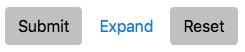
Tag options for buttons
<button class="btn" type="submit">Submit</button>
<a class="btn" href="#" role="button">Expand</a>
<input class="btn" type="reset" value="Reset">
Click here to have a go yourself….
Standard Button Styles
Up to now we have added any styles to the buttons. Having said that, even with the very simplified code above some style will be applied. There are a number of colours we can apply to our buttons. This is pretty helpful to convey some kind of meaning. For example you might want to use green to submit a form or perhaps red to reset a form.
Whatever you chose, remember users who rely on assistive technology like screen readers will not benefit for your use of colour. As such you should make sure the content (probably text) of the button tells the user what the button does (e.g. by writing “submit” on your green submit button). If it doesn’t you should consider hiding some text on the button using the .sr-onlyclass. This will allow screen readers to tell the user what the button does without anyone else seeing that text.

Standard Bootstrap 4 button styles
<button type="button" class="btn btn-primary">Primary</button>
<button type="button" class="btn btn-secondary">Secondary</button>
<button type="button" class="btn btn-success">Success</button>
<button type="button" class="btn btn-danger">Danger</button>
<button type="button" class="btn btn-warning">Warning</button>
<button type="button" class="btn btn-info">Info</button>
<button type="button" class="btn btn-light">Light</button>
<button type="button" class="btn btn-dark">Dark</button>
<button type="button" class="btn btn-link">Link</button>
Click here to have a go yourself….
Outline Button Styles
If you don’t want your buttons to be filled with colour there are also the options for outline buttons. On these the colour is applied to the border and the text with the background removed as shown below. They have a particularly cool hover style imo.

Outline button styles
<button type="button" class="btn btn-outline-primary">Primary</button>
<button type="button" class="btn btn-outline-secondary">Secondary</button>
<button type="button" class="btn btn-outline-success">Success</button>
<button type="button" class="btn btn-outline-danger">Danger</button>
<button type="button" class="btn btn-outline-warning">Warning</button>
<button type="button" class="btn btn-outline-info">Info</button>
<button type="button" class="btn btn-outline-light">Light</button>
<button type="button" class="btn btn-outline-dark">Dark</button>
Click here to have a go yourself….
Button Sizes
Bootstrap also gives you several options for the size of your buttons so you can pick the most appropriate for your project. For the standard size button you do not need to add any additional classes (although .btn-md will have the same effect). A larger button than usual requires .btn-lg. A smaller button requires .btn-sm.
Outside of the three “normal” buttons, there are also block level buttons. A block level button takes up the full width of its parent element. To create a block level button simply add .btn-block to your code.
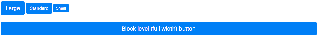
Various button sizes
<button type="button" class="btn btn-primary btn-lg">Large</button>
<button type="button" class="btn btn-primary">Standard</button>
<button type="button" class="btn btn-primary btn-sm">Small</button>
<button type="button" class="btn btn-primary btn-lg btn-block">Block level (full width) button</button>
Click here to have a go yourself…
Disabled / Active States
Bootstrap 4 buttons have built in styles for active states (i.e. when the button is being pressed), hover states (i.e. when the mouse cursor is over the button) and disabled states (i.e. when the button cannot be pressed).
You can force buttons to take on the active and disabled states easily. To make a <button> or a button styled <a> look like it’s pressed you just add .active. If you force the <button> or <a> to appear active using the .active class you should also add aria-pressed="true" for the benefit of those using assistive technology like screen readers.
To make a <button> unclickable you simply add the disabled attribute to it.
To make an <a> appear disabled you need to add the .disabled class to it as the disabled attribute is not supported on <a> elements. You should add aria-disabled="true" to your disabled <a> element for the benefit of those using assistive technology.
The .disabled class uses pointer-events: none to prevent the link working. However, users who are browsing with keyboard navigation will still be able to activate the link. To prevent this you can add tabindex="-1" which will stope the keyboard being able to focus on them. You can also use some JavaScript to stop them working but that’s for another post.
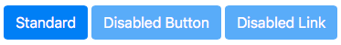
Disabled buttons with a standard button for comparison
<button type="button" class="btn btn-primary" disabled aria-disabled="true">Disabled Button</button>
<a href="#" class="btn btn-primary disabled" tabindex="-1" role="button" aria-disabled="true">Disabled Link</a>
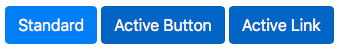
Active buttons with a standard button for comparison
<button type="button" class="btn btn-primary active">Active Button</button>
<a href="#" class="btn btn-primary active" role="button" aria-pressed="true">Active Link</a>
Click here to have a go yourself….
Conclusion
So those are your basic button types and styles. With the explanation here plus the examples for you to play around with, hopefully you’ll be able to get some cool buttons into your project. Once you’re confident with these you can check out our next button-related post, Bootstrap 4: Button Groups.