

Introduction
Button groups are, as the name suggests, a bunch of buttons grouped together. This gives them the appearance of a single element on your page. As with all Bootstrap 4 components they are flexible and allow you to put your own look onto them to fit in with your project. Use your imagination and you can create some cool-looking, useful features with these button groups.
Standard Button Group
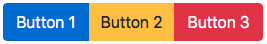
A standard button group is created by wrapping a bunch of buttons in btn.group. Don’t forget the individual buttons must include the .btn class. I’ve made each of the buttons within the group a different colour to more clearly define them.
Assistive technologies like screen readers require that you add role="group" to the .btn-group. You also need to add a label so screen readers will announce the group to the user. You can use either aria-label or aria-labelledby.
Standard button group
<div class="btn-group" role="group" aria-label="Standard Button Group">
<button type="button" class="btn btn-primary">Button 1</button>
<button type="button" class="btn btn-warning">Button 2</button>
<button type="button" class="btn btn-danger">Button 3</button>
</div>
Click here to have a go yourself….
Button Group Sizes
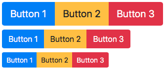
In the same way that Bootstrap offers you sizing options for individual buttons, it offers sizing options for button groups too. With button groups you do not need to size each of the individual buttons. Instead you just add sizing options to the button group itself. So for a larger button group you add .btn-group-lg to the .btn-group and for a smaller button group you add .btn-group-sm.
Button group sizes
<div class="btn-group btn-group-lg" role="group" aria-label="Large Button Group">
<button type="button" class="btn btn-primary">Button 1</button>
<button type="button" class="btn btn-warning">Button 2</button>
<button type="button" class="btn btn-danger">Button 3</button>
</div>
<div class="btn-group" role="group" aria-label="Standard Button Group">
<button type="button" class="btn btn-primary">Button 1</button>
<button type="button" class="btn btn-warning">Button 2</button>
<button type="button" class="btn btn-danger">Button 3</button>
</div>
<div class="btn-group btn-group-sm" role="group" aria-label="Small Button Group">
<button type="button" class="btn btn-primary">Button 1</button>
<button type="button" class="btn btn-warning">Button 2</button>
<button type="button" class="btn btn-danger">Button 3</button>
</div>
Click here to have a go yourself….
Vertical Button Group
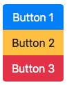
The default setting for button groups, as we’ve seen, is for the buttons to group horizontally. If you want to group your buttons vertically do not fear… Bootstrap has classes to let you achieve that easily. Simply replace .btn-group with .btn-group-vertical.
Vertical button group
<div class="btn-group-vertical" role="group" aria-label="Vertical Button Group">
<button type="button" class="btn btn-primary">Button 1</button>
<button type="button" class="btn btn-warning">Button 2</button>
<button type="button" class="btn btn-danger">Button 3</button>
</div>
Click here to have a go yourself….
Button Toolbar
If you want to create something a little more complicated you can put button groups together to form button toolbars. This is done by wrapping your button groups in .btn-toolbar. In order to space the groups as you wish you will need to use some of Bootstrap’s utility classes. You will notice in the example below I’ve simply added a horizontal margin to the middle button group in the toolbar.
To make sure a toolbar is accessible to assistive technologies like screen readers we need to add a role and an aria-label just like we have done to the button groups. For the toolbar you add role="toolbar" and then a suitable aria-label.

Button toolbar
<div class="btn-toolbar" role="toolbar" aria-label="Button group toolbar">
<div class="btn-group" role="group" aria-label="Button group 1">
<button type="button" class="btn btn-primary">Button 1</button>
<button type="button" class="btn btn-warning">Button 2</button>
<button type="button" class="btn btn-danger">Button 3</button>
</div>
<div class="btn-group mx-4" role="group" aria-label="Button group 2">
<button type="button" class="btn btn-success">Button 4</button>
<button type="button" class="btn btn-info">Button 5</button>
</div>
<div class="btn-group" role="group" aria-label="Button group 3">
<button type="button" class="btn btn-secondary">Button 6</button>
<button type="button" class="btn btn-dark">Button 7</button>
</div>
</div>
Click here to have a go yourself….
Button Group With Dropdown
If you want to add a dropdown menu to one of your buttons within a button group you do so by nesting one button group within another. This is a really useful feature and, once you know how to do it, really quite easy to achieve.
You’ll see in the example how we have the first two buttons of the group set up as the examples above then, when we get to the button we want to contain a dropdown, we simply put it in a button group of it’s own, nested in the original button group. We can add other buttons after the dropdown if we choose, then we simply close the original button group, wrapping everything up.
On your dropdown button you should add aria-haspopup="true" and aria-expanded="false". You should then add aria-labelledby to your dropdown menu using the id of your dropdown button (i.e. dropBtnGroup in my example). These are keep your project accessible to assistive technology like screen readers.
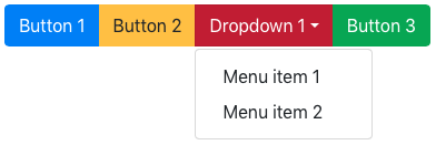
Button group with dropdown menu
<div class="btn-group" role="group" aria-label="Dropdown nested in button group">
<button type="button" class="btn btn-primary">Button 1</button>
<button type="button" class="btn btn-warning">Button 2</button>
<div class="btn-group" role="group" aria-label="Dropdown menu">
<button id="dropBtnGroup" type="button" class="btn btn-danger dropdown-toggle" data-toggle="dropdown" aria-haspopup="true" aria-expanded="false">
Dropdown 1</button>
<div class="dropdown-menu" aria-labelledby="dropBtnGroup">
<a class="dropdown-item" href="#">Menu item 1</a>
<a class="dropdown-item" href="#">Menu item 2</a>
</div>
</div>
<button type="button" class="btn btn-success">Button 3</button>
</div>
Click here to have a go yourself….
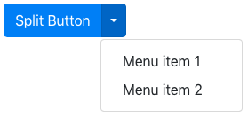
Split Buttons
Using button groups you can also create split button dropdowns. This is where the dropdown toggle acts and appears as a button in its own right whilst remains attached to the main part of the split button. Adding .dropdown-toggle-split to the dropdown sorts the styling of the caret to keep it looking good.
For accessibility we should add a span with .sr-only within the dropdown toggle. This is, as I mentioned in my other post Bootstrap 4: Buttons, because screen readers will need an explanation as to what the button is for.
Split button
<div class="btn-group">
<button type="button" class="btn btn-primary">Split Button</button>
<button type="button" class="btn btn-primary dropdown-toggle dropdown-toggle-split" data-toggle="dropdown" aria-haspopup="true" aria-expanded="false">
<span class="sr-only">Dropdown toggle</span>
</button>
<div class="dropdown-menu">
<a class="dropdown-item" href="#">Menu item 1</a>
<a class="dropdown-item" href="#">Menu item 2</a>
</div>
</div>
Click here to have a go yourself….
Conclusion
Button groups, when used well, can create some really useful tools for your users. Hopefully with all the explanation above and the “have a go yourself” examples you’ll quickly get to grips with button groups and will be able to put some cool components into your project.