


What is a Card?
A card is an highly flexible component of Bootstrap 4. In essence they are simply a bordered box or container with built in padding for the content. They replace panels, wells and thumbnails that were present in Bootstrap 3.
The control and ability to customise cards makes them one of my personal favourite components of Bootstrap 4. The degree of control and the level of customisation available to you is all the more impressive given how little markup and styles have been used to create them.
There are numerous options available to you with cards. For example headers, footers and contextual colours. They also support a wide variety of content types. For example text, images and lists.
You can check out all the examples below and have a go yourself here.
Let’s look a little further into the types of content and how to put a card together.
Getting started
As I just said, there are loads of content types you can put into a card. We need to know how to make a simple card in the first instance though so here’s how you do that.
A simple card is created with the .card class. Inside that goes the .card-bodywhich gives you a padded area in which to place your content.
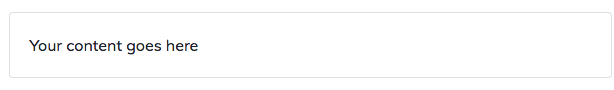
A simple card
<div class="card">
    <div class="card-body">Your content goes here</div>
</div>
Sticking with the .card-body for the time being, there are a number of classes available to us which allow us to manipulate our content.
Text
To create a title in a card you can add .card-title to any <h*> tag. You can then take this a step further with a subtitle. This is done by adding .card-subtitle to an <h*> tag. You might want to consider adding a class such as .text-muted to the subtitle. The addition of .card-title and .card-subtitle to <h*> tags within a .card-body alters some of the margins and ensures they line up nicely.
Once we’ve got our title and subtitle in place we can put some written content underneath. As usual, you would do this in your <p> tags but, unlike usual, you should add .card-text to your <p> tags. Adding .card-text has the effect of removing the bottom margin from that <p> element assuming it is the last, or only, child inside the .card-body.
If you have links to place in your .card-body you should add .card-link to your <a> tags. This class makes the link blue and gives the text a hover effect. When you have more than one link directly following one another, the class will also add a left margin to all but the first of the links.
When we add all these parts together you will end up with something like the example below.
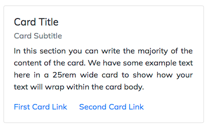
Card with text
<div class="card" style="width: 25rem;">
  <div class="card-body">
    <h5 class="card-title">Card Title</h5>
    <h6 class="card-subtitle text-muted mb-2">Card Subtitle</h6>
    <p class="card-text">In this section you can write the majority of the content of the card. We have some example text here in a 25rem wide card to show how your text will wrap within the card body.</p>
    <a href="#" class="card-link">First Card Link</a>
    <a href="#" class="card-link">Second Card Link</a>
  </div>
</div>
Lists
We can make some really nice looking lists in cards using .list-group and .list-group-flush in your <ul> tags and .list-group-item in your <li> tags.
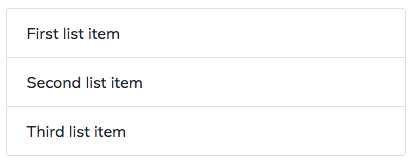
Card list
<div class="card" style="width: 25rem;">
  <ul class="list-group list-group-flush">
    <li class="list-group-item">First list item</li>
    <li class="list-group-item">Second list item</li>
    <li class="list-group-item">Third list item</li>
  </ul>
</div>
Images
There are two basic classes we would add to images within a card. These are .card-img-top and .card-img-bottom. Somewhat unsurprisingly .card-img-topplaces the image at the top of the card whilst .card-img-bottom places it at the bottom. In the example below you will note that the image is placed outside the .card-body. This allows the image to span the full width of the card.
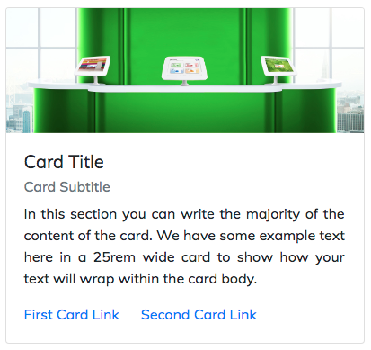
Card image
<div class="card" style="width: 25rem;">
  <img class="card-img-top img-fluid" src="welcm-software.jpg" alt="Card image">
  <div class="card-body">
    <h5 class="card-title">Card Title</h5>
    <h6 class="card-subtitle text-muted mb-2">Card Subtitle</h6>
    <p class="card-text">In this section you can write the majority of the content of the card. We have some example text here in a 25rem wide card to show how your text will wrap within the card body.</p>
    <a href="#" class="card-link">First Card Link</a>
    <a href="#" class="card-link">Second Card Link</a>
  </div>
</div>
The last class we’ll look at for images is .card-img-overlay. This class allows you to use an image as the background of your card and add your content on top of it. Note that we are using .card-img-overlay in place of .card-body in this example.
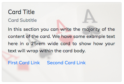
Card image overlay
<div class="card" style="width: 25rem;">
  <img class="card-img-top" src="aces.jpg" alt="Overlaid card image">
  <div class="card-img-overlay">
    <h5 class="card-title">Card Title</h5>
    <h6 class="card-subtitle text-muted mb-2">Card Subtitle</h6>
    <p class="card-text">In this section you can write the majority of the content of the card. We have some example text here in a 25rem wide card to show how your text will wrap within the card body.</p>
    <a href="#" class="card-link">First Card Link</a>
    <a href="#" class="card-link">Second Card Link</a>
  </div>
</div>
Headers & Footers
Adding .card-header and / or .card-footer is not required but can give a nice effect in the right circumstances. In its natural state a light grey background will be added to the header or footer. It will also put a 1px border (with no radius) between the header / footer and the .card-body. It is likely you would want to add .card-header to <h*> tags as I have done but it is not essential. As with .card-subtitleyou might want to consider adding .text-muted to your footer text. Check out the example below.
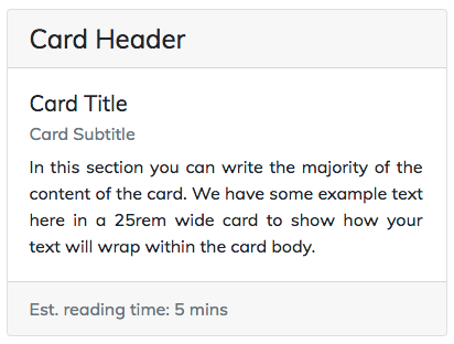
Card with header and footer
<div class="card" style="width: 25rem;">
  <h4 class="card-header">Card Header</h4>
  <div class="card-body">
    <h5 class="card-title">Card Title</h5>
    <h6 class="card-subtitle text-muted mb-2">Card Subtitle</h6>
    <p class="card-text">In this section you can write the majority of the content of the card. We have some example text here in a 25rem wide card to show how your text will wrap within the card body.</p>
   </div>
   <div class="card-footer text-muted">Est. reading time: 5 mins</div>
</div>
Colours
We’ve now got the core elements of our cards into place so we can now look at adding some contextual classes to the card. The use of these classes (e.g. .bg-success) on your card will add a background colour to the card. You may need to use text utilities to ensure the content looks right once you change the background colour of the card.
I haven’t included all available options here but you can check out more information about those utilities via this link. Note that in the example I have added a small margin to the bottom of the cards to keep them nicely spaced.
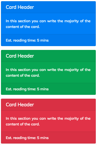
Cards with contextual colours
<div class="card mb-3 bg-primary text-white" style="width: 25rem;">
  <h5 class="card-header">Card Header</h5>
  <div class="card-body">
    <p class="card-text">In this section you can write the majority of the content of the card.</p>
  </div>
  <div class="card-footer">Est. reading time: 5 mins</div>
</div>
<div class="card mb-3 bg-success text-white" style="width: 25rem;">
  <h5 class="card-header">Card Header</h5>
  <div class="card-body">
    <p class="card-text">In this section you can write the majority of the content of the card.</p>
  </div>
  <div class="card-footer">Est. reading time: 5 mins</div>
</div>
<div class="card mb-3 bg-danger text-white" style="width: 25rem;">
  <h5 class="card-header">Card Header</h5>
  <div class="card-body">
    <p class="card-text">In this section you can write the majority of the content of the card.</p>
  </div>
  <div class="card-footer">Est. reading time: 5 mins</div>
</div>
If you don’t want to colour the entire card but still want to convey meaning with colours you might want to consider simply changing the colour of the borders. This can be done relatively simply using Bootstrap’s border utilities. You can change both the border of the entire card as well as the border of the headers / footer. You might want to consider changing the text of the .card-body too. See the example below.
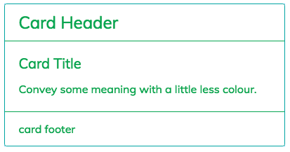
Card with border and text colour
<div class="card border-success" style="width: 25rem;">
  <h4 class="card-header border-success text-success bg-white">
    Card Header
  </h4>
  <div class="card-body text-success">
    <h5 class="card-title">Card Title</h5>
    <p class="card-text">
      Convey some meaning with a little less colour.
    </p>
  </div>
  <div class="card-footer border-success text-success bg-white">
    card footer
  </div>
</div>
Conclusion
Hopefully with the explanation above and the "have a go yourself" examples I've provided there is more than enough to get you going with cards. There is of course more we can do with them such as adding navigation but that’s for another time. Look out for my post about card layouts too. That will help you bring together a series of cards in a really useful format. Goodbye for now from me and my favourite Bootstrap 4 component, Cards!