Introduction
In this post we’re going to give you a quick overview of floating action buttons (FAB)… a TLDR; if you like. Because this is a quick guide we’re just taking a high level view. I’ll go into more detail in further articles.
What are they?
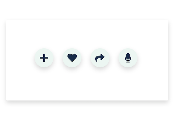
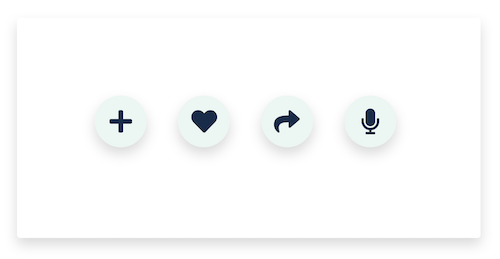
A floating action button, or FAB, is in most cases an icon displayed in a circular container. More often than not the button will have a shadow giving it a raised effect. They also stay in position as the rest of the screen content scrolls. That is why they are referred to as “floating”.
Note, sometimes an FAB may be elongated and even contain text.
What are they for?
Put simply, they are primary action buttons. That means they represent the most important action that can be performed by the user. They are used for important or “constructive” actions rather than minor or “destructive” actions.
Examples of important or constructive actions include: create, favourite, share and start a process.
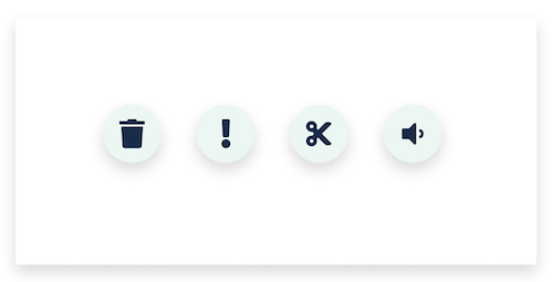
Examples of minor or destructive actions include: archive / trash, alerts / errors, cutting text, controls that should be in a toolbar (e.g. volume control).
Why should I use them?
There are two main reasons to use a floating action button. One is to improve the UX of your app. The other is to increase conversions on your website.
In the context of UX, FABs give your user quick access to the thing they are most likely to want to do on a given screen. For example, in an inbox an FAB might be used to create a new email.
In the context of increasing conversions, you can keep a CTA on the screen at all times. It remains prominent whilst not getting in the way of content. As such it can’t be ignored but is unlikely to frustrate a user.
This is in stark contrast to pop-ups that used to be popular for achieving this goal. For example, an e-commerce site may use an FAB for adding items to the user’s cart.
Further Reading (coming soon)
How to make a floating action button (FAB) using Bootstrap and Font Awesome
The spec of a Floating Action Button (FAB)
Floating Action Button Dos and Don’ts


