


Introduction
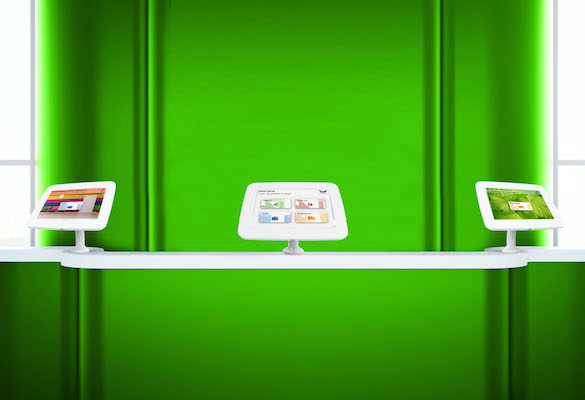
I’ve been hunting down touchscreen kiosks on my travels recently. I have been actively looking out for them (sometimes even asking if there is one) and every time I see one I have a go on it. If there are other people using it already I don’t mind waiting as I get to see how people interact with it… are they getting frustrated, are they impressed, do they seem to be getting what they wanted from it.
I’m not blind to how nerdy this makes me sound but, hey, UX is my “thing” and this sort of research makes me better at what I do… I also accepted I’m not a particularly cool guy long ago! I have heard that being nerdy actually is cool so perhaps checking out kiosks in your spare time is cool?!?! Probably not. Anyway… I digress.
The Problem
Touchscreen UX is my particular specialisation. I’ve always said that kiosk UI’s are all too often designed like a desktop UI. Kiosk software designers regularly seem to work on the basis of the screen size when designing for a kiosk rather than on the basis of interaction type (i.e. your fingers rather than a mouse). By that I mean they make the kiosk software look and behave like a desktop app just because the screen is desktop PC size.
I ❤️ Touchscreens
I believe touchscreen are, by their very nature, a more intuitive way to interact than with a mouse and a cursor. Anyone who has introduced an elderly relative to an iPad having previously tried to show them round a PC will be able to testify to this point.
As Apple’s early iPad advert stated, “You already know how to use it”. That is a phrase that stuck with me and one that I have in mind when designing any UI. A kiosk is more often than not unattended and so users need to be able to use it without any outside instructions. For me, a piece of kiosk software is a failure if users don’t already know how to use it when they first pitch up at the kiosk.
Change Your Outlook
So if desktop applications should not be the source of design inspiration what should? I believe mobile design is much more similar and should be used as the basis of our thinking. Yes the screen size of your average phone is tiny compared to a touchscreen kiosk but the way you interact with them is identical. You see things, you touch them, stuff happens.
Tweak Your Designs
Designers of kiosk software will often fall into the trap of going back to standard desktop design for certain functionality. For example they may choose to use a touchscreen’s built in keyboard for some kind of data entry when a more touch friendly solution could have been used.
A specific example of this is a visitor sign in system I used recently. When it came to leave the building I went to sign out. Now, in my opinion, visitor sign in systems should make the experience of signing in and out more pleasurable (or at least less annoying!) for visitors. As such I was disappointed when I was prompted to type my name in again to sign out. Obviously typing my name isn’t exactly a hardship but it is slower than writing “2:45” (the time I left) in a visitor book. That is particularly true as the screen was bolt upright, I’m fairly tall and so missed the space between my first and last names (excuses, excuses, right!). That meant my name wasn’t found and I had to type it again, this time with the space.
At Welcm we make visitor management systems and have done for years. In that time I’ve learnt that asking people to type their name when they leave a building has one main effect… people do not sign out. This is obviously a problem for security, health & safety and reporting. As such we go for a more touch and user friendly method where visitors simply select their name… much in the same way we are all used to doing in traditional paper sign in books. The difference is you just have to tap a button rather than write down a time. A simple change like this means people are perfectly happy to sign out, UX is improved and the visitor management system is more useful to the business.
Information kiosks such as those you might find at a museum or in a shopping centre are also often designed using desktop principals. For example, users will be made to tap buttons to interact with content rather than simply interacting with the content directly. I’ve seen large display maps on kiosks in shopping centres where floor plans have the names of the shops on them. To get information about the shops you have to tap the shop name on a list next to the map. In my opinion the list is totally unnecessary and takes up screen it does not need to. When we have created such systems we have avoided this and made the map itself interactive. Tap the shop on the map and that is what generates the relevant content. User experience is again improved as there is less effort and time required for them to achieve their goal.
Conclusions
- Don’t look to desktop apps for inspiration when creating a kiosk app.. look to mobile apps!
- Avoid keyboard input where possible… look for a more touch friendly alternative!
- Avoid buttons for interacting with content… let users interact with the content itself!
- Don’t leave your kiosk software development project in the hands of generalists… talk to a specialist (like us ?)!