Introduction
Accessibility is about inclusivity. Creating accessible software and web sites supports social inclusion. It helps people with disabilities, older people, people in rural areas and developing countries. Accessibility can even benefit those without disabilities as evidenced in this video from the Web Accessibility Initiative (WAI). You can also read more about that in our blog post, "How Accessibility Helps Us All".
A concern for businesses is often that making their software or website accessible to as many people as possible is expensive. This needn't be the case though, particularly if the software or website is built with accessibility in mind from Day 1. In fact, case studies have shown that there is actually a strong business case for focussing on accessibility in your software or web site projects. For example, accessible software increases your audience reach and accessible web sites have better search results.
In this article we'll take a high level view at the key points your should consider when creating an accessible kiosk solution. We will look at both the kiosk hardware you select and the kiosk software it runs.
Kiosk Hardware
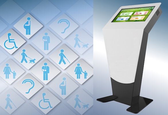
A lot of people will often simply consider wheelchair users when thinking about kiosk accessibility. In many cases those with either a vision or hearing impairment are forgotten about. We need to make sure that when selecting our kiosk solution we consider all disabilities and make sure our solution is as inclusive as possible. Ultimately self-service kiosks are about creating user-friendly solutions.
Wheelchair Users
Predominantly kiosks will have a side-on approach for wheelchair users. Without wishing to state the obvious, this means wheelchair users will pull up parallel to the kiosk rather than using in straight-on. This gives the user a bit more space and reach without having any significant detrimental effects.
It isn't just the kiosk itself that has to be considered but also the way it is installed. We need to ensure that when the kiosk is installed its mounting doesn't obstruct wheelchair users. With this in mind we can then make sure our kiosk and its installation is well-designed and thought out to allow a wheelchair user to approach and use the kiosk.
The kiosk itself should be designed to make sure a wheelchair user can interact with it fully. All interaction points and peripherals must be kept within reach. This means the touchscreen itself, keypads, printers and so on must all be accessible by the user.
The key design points to consider are as follows:
- The highest touch point for the user (i.e. the maximum height the user will have to reach to use the kiosk)
- The height and reach of each individual user element (i.e. the screen, keypad, printers and so on)
- The kiosk installation is suitable (i.e. no obstruction caused by the mounting of the kiosk or its surroundings)
Visually Impaired Users
Screen reading technology is widely available and is in fact present in most operating systems these days. In order to allow this to operate we need to consider incorporating speakers into our kiosks if appropriate. Alternatively we can look to install a headphone jack if using speakers is not appropriate.
The ability to zoom in on screens is also widely available and should be made available whenever possible. It is generally possible to disable the zoom feature but that would not be advisable if you want to create an accessible solution. Most people will not need to use the zoom feature and won't use it but if zoom helps people they should be able to use it.
Incorporating a keyboard into your kiosk can also be a useful tool for the visually impaired as it can provide control over the kiosk from a familiar tool. It can allow the user to easily make use of the accessibility features your kiosk software can incorporate.
Deaf and Hard of Hearing Users
With many kiosk solutions there is no sound involved meaning little has to be done to ensure those with a hearing impairment can successfully use the kiosk. However if your kiosk solution does incorporate sound there are ways we can include those with a hearing impairment.
Many operating systems now include auto captions. Ensure that your kiosk PC has been set up to allow these to operate on your kiosk. They can generally be customised to precisely fit a users needs so make sure your setup is the most appropriate for the application. Again a headphone jack can help some users with a hearing impairment.
KIOSK SOFTWARE
The considerations with your kiosk software is just as important as your considerations around the hardware. There is no point creating a great, accessible kiosk where you've considered as many users as possible if your software doesn't do the same.
Wheelchair Users
Kiosk software developers should look to create a design that keeps the key touch points within easy reach of wheelchair users. Whilst all the touchscreen should be in reach of the wheelchair user we do not want the user to have to stretch to the top of the screen unnecessarily. Wherever possible touchpoint such as buttons should be kept towards the lower parts of the screen making the use of the kiosk as easy and comfortable as it can be.
As it is likely the wheelchair user will be using the kiosk side-on there we need to consider that it they will be interacting with the touch screen with one hand. Keeping the number of touches required is therefore a good rule of thumb to follow. This means trying to keep typing to a minimum wherever possible.
Visually Impaired Users
A very quick and easy thing to consider when designing your kiosk software is the colour contrast. This is such an easy change to make but one that can really make a big difference to your visually impaired users. Similarly using grayscale can also provide some much needed assistance to some users.
Making sure your kiosk software doesn't override built in accessibility tools like screen reading is really important. Many visually impaired technology users rely on tools such as screen readers and zoom to allow them to use software most of us take for granted. Giving easy access to zoom capabilities can be very important. Your kiosk software developer should be able to discuss options with you.
Creating clean and clear designs should be a given but this is particularly important for visually impaired users. Creating an unfamiliar or cluttered design is not advisable at the best of times but will have a particularly negative impact for visually impaired users.
Your software developer may also be able to include video descriptions into your kiosk software. These will provide the visually impaired user with a spoken description of visual content, for example diagrams and videos.
You may want to consider adding dictation tools to your kiosk software if appropriate. These can be used to varying degrees and may or may not be appropriate for your user case. Again, speak to you kiosks software developer to discuss this.
Deaf and Hard of Hearing Users
The immediate thought when making kiosk software accessible to the deaf or hard of hearing is including subtitles and captions. These really are extremely important if your kiosk relies on sound to communicate with its users. You kiosk software developer should be able to ensure subtitles and captions are available and used.
Fortunately most kiosks do not rely on sound to communicate a great deal of information with users. However an often overlooked part of this are audible alerts. If your kiosk software is going to use audible alerts then it is wise to back this up with a visible flash of the screen. This is a recognised way of alerting the deaf or hard of hearing and helps ensure important alerts are not missed.
Conclusion
When planning and speccing kiosks solutions we should be considering how everyone will interact with it. When designing a kiosk solution we should look to get the input of those with disabilities and take their feedback. If the application of your kiosk means it can not be accessible for all you should still look to make it as accessible as possible. Some degree of accessibility is better than none.
Don't be too concerned if you have kiosks that are not accessible. Take this on as an opportunity for improvement. Your kiosk software can be upgraded to bring in accessibility features. Your kiosk hardware can also be upgraded to add accessibility features. Making your existing kiosks accessible to as many users as possible can be an iterative process. You don't need to do everything all at once. Assuming it needs to be an all or nothing approach can be what stops change occurring.
As kiosk software developers, kiosk manufacturers and kiosk owners we all need to do our bit to give equal access to technology for all users.


